In the making of our magazine cover, we had many ideas and techniques we wanted to use. We flat planned our layout including text, images and effects to ensure everyone had a part in creating it. First of all we produced a first draft of our magazine cover.
+.jpg)
I found this too blury and unclear. it is also unattractive and would not be draw to it on the magazine stand. The text is far too busy and hard to read. The colour of the text doesnt contrast with the background adding to the confusion/unclear look. Therefore my group sat down to disscuss the issues and negative poi9nts of the cover and suggested elements we coul re-do and make better. For instance, use a differetn image. After this we dicided to link the main image to our poster to link our campaign. This image represents the victim in a vunrable position suggesting the genre and storyline.
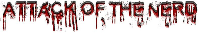
This is the re-make of our magazine cover...
 This is so much better than the first draft of our Film magazine Cover. the text is eaisy to read and the page stands out. It looks professional and relistic, therfore this would be a big hit on the magazien stand. The text weaves around the image creating an effect that the audience is drawn to the image qwithout it over powering the whole page.
0 comments:
Post a Comment